
Monday, January 31, 2011
Endurance

I may be less than keen about any of my imaginary readers getting the idea that this is more of a music blog than an art blog. I really don't consider myself a music expert, and the term "body music" is altogether off-putting to me. None of that matters. Today I listened to a mix by the dj LVR for the blog Endurance (both London based), and really liked it. Valis and White Car, two bands I was lucky enough to see live several times while living in Chicago, are both on their most recent compilation. It's not new, but it's definitely worth a look.
Thursday, January 27, 2011
Christian Philipp Müller at Murray Guy

It seems worth taking for granted that art is an eminently social (and institutional) thing. This is to say that if you care about contemporary art, then sooner or later you're going to have to pay attention to the way that the values of artists, teachers, and viewers are worked out institutionally, that is, the way art schools, museums, and galleries express people's ideas about what matters. Physical and social factors that affect how a neighborhood, gallery, or neighborhood of galleries is built end up affecting the art object and the art-viewing experience in ways which, while at times arbitrary, are rarely uninteresting.
This is basically the business that Swiss artist Christian Philipp Müller is in. The subject of his work, 31 in Chelsea, now on view at Murray Guy through February 19th, is the physical and social factors that shape an area that houses a sizable fraction of the contemporary art galleries operating in New York City. The piece gets its name from the thirty-one metal cash boxes (one for each day of the exhibition) placed on a low table in the center of the gallery, each of which contains clippings from posters, magazine advertisements, and a small thin moleskin of scribbled quotations about the neighborhood from people the artist has encountered. In addition to this, further quotations are printed on pieces of printer paper and arranged in the shape of a calendar on the opposite wall.
Müller's portrait, then, is a communal and social one, and a major feature of it is the general condition of disconnection and alienation that seems to color life in Chelsea. This seems altogether fair. Between galleries in the neighborhood and anything, well, not having directly to do with galleries, commerce is reliably scarce, almost to the point of exclusivity. Elevator operators might ask someone who doesn't look like he or she belongs there who they're visiting on the night of an opening. A couple of times, I've seen men in sooty white sneakers and ill-fitting coats firmly turned away (Ed. Note to self: buy new sneakers). There are marinated eggplant and goat cheese sandwiches available at one of the restaurants on 10th Ave. that I really liked having for lunch when I interned at Magnan Metz. I doubt anyone living in the housing project a few blocks away has tried them.
Like Chelsea's galleries, the boxes are squarely closed off from one another, their arrangement seemingly arbitrary and artificial. The quotes themselves seem at once cosmopolitan and naive, with splenetic rants about the High Line Park from natives mixed with lines from the websites of chic bars and newly-developed high rises. The rhythm is disjointed and uneven. One doubts that any of the people quoted were neighbors or friends. The tone of the resulting portrait--quite gray--is not far from the experience of actually visiting galleries in this neighborhood. Seeing Chelsea through Müller's eyes one is forced to suspend (perhaps anachronistic) ideas about how life in many contemporary neighborhoods (in New York and beyond) is really lived.
I was able to catch the performance segment of Müller's piece at 1OAK the week before last:
In the altogether likely event that you're not exhilarated by the above clip, I would highly recommend giving the show an in-person look.
Murray Guy is located at 453 W 17th St (on the North side of the street, between 9th and 10th Aves), Unit No. 3SW.
Friday, January 14, 2011
Thursday, January 13, 2011
R. Justin Stewart
 |
| R. Justin Stewart, 2am to 2pm, 2008, copper, wood, thread, steel, dimensions variable. |
Motherwell: Would you say that a fair statement of your position is that the "meaning" of a work of art consists of the relations among the elements, and not the elements themselves?
Hofmann: Yes, that I would definitely say. You make a thin line and a thick line. It is the same with geometrical shapes. It is all relationship. Without all these relationships it is not possible to express higher art.
(From an interview in Modern Artists in America, First Series (1952), edited by R. Motherwell, Ad Reinhardt, and B. Karpel, p. 19, 39).

It's worth mentioning that some of Stewart's works really do describe or "map out" physical spaces. This is certainly apparent in his impressive (like, really impressive) work 2am to 2pm (2008), a sculpture built to represent the relative positions of buses and metro trains on the Minneapolis public transit system over a twenty-four hour period. With each stop on a given transit line represented by a wooden ball, a bus or train's movement through space is represented horizontally. Time is represented vertically, with each new bus or train route represented by a parallel chain of balls and sticks sitting beneath it. With an array of threads running through the resulting web of balls and sticks, the entire structure floats gracefully above the gallery floor, suspended by a pair of weights on each end, which themselves hang in the air like long-stringed bells. Each element of the piece relies heavily on the others to stay in place, forming a complex and utterly balanced structure.
I'm not so confident in my ability to describe Stewart's work as to omit a link to his website, www.rjustin.com. The fact that his works are so difficult to describe is indeed part of the thrill. Several times in conversation with Risa Shoup, the curator I work with who hopes to include his work in her show at the Invisible Dog in Brooklyn, Stewart described his works matter-of-factly as an expression of what was "in his head." In his Systems of Knowing series (the drawings for which look more like maps than 2am to 2pm but aren't), circles and lines could be read for actual spatial or physical data--as a blueprint, perhaps, for the sculptural versions of the two-dimensional drawings in which they appear--but they could also carry meaning simply and exclusively for one another. Stewart's admission that the drawings could have taken many different sculptural permutations than the one he chose to fabricate gave the pieces a somewhat open-ended character, but the works are altogether inert and self-contained. One gathers from looking at Stewart's work a rather transcendental attitude. Very little sleep is lost over whether the ideas he's working with might defy verbal description.
Monday, January 10, 2011
Michael Anderson: The Street is My Palette at Claire Oliver Gallery
Even a close reader of Lippard's book Pop Art, (New York : Thames and Hudson, 1996), can find it hard to produce a concise definition of the movement that gives the book its title. Surely, Andy Warhol, Claes Oldenberg, and Roy Lichtenstein had something in common; they all found a way to re-appropriate images from pop culture into painting, sculpture, drawing, and collage. Yet reasonable people could object to describing the goals or preoccupations in their work as part of a "movement." They had no written manifesto to stand by, and while some Pop artists--most of all Warhol--embraced the identity of an eccentric celebrity, he was not an enthusiastic or articulate spokesman (please try to find it in your hearts to forgive me for not properly footnoting Donna De Salvo's book, Success Is a Job in New York: the Early Art and Business of Andy Warhol here; I haven't figured out how to do that yet). Compared to the the meditative, intellectual attitude of, say, many Abstract Expressionists, Pop art seems invoke a shoulder shrugging, almost nihilist sensibility, typified by Warhol's judgment that art was simply "what you can get away with."
To be fair, there is something quite different from nihilism--indeed quite cheerful and optimistic--in the embrace by fine art world of images from pop culture. If you put a picture of a soup can on a wall-size canvas, frame it, and place it on a gallery wall, people may very well contemplate that image in a new way, and walk away with a mindfulness and appreciation of line, color, and form that can and should work outside of the museum space. In this context, viewers use tools that often atrophy when our senses are bombarded by the stimuli of advertising and mass media. Pop art assumes a certain ability on part of the viewer to adapt to a new, vigorous visual language, and inasmuch as it promotes this reversal, Pop art is optimistic.

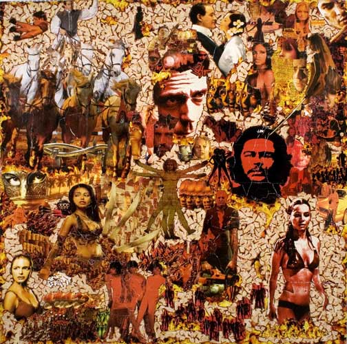
What's troubling about Michael Anderson's solo show now on view at the Claire Oliver Gallery on West 26th St is how little the works chart out a language in which people can see or read images from TV, movies, and advertising in a new and concrete way. While the collages--made from pasting together cut out sections of street advertisements and billboards--show an immense amount of meticulous technique and energy, the energy seems indirect, indiscreet, and random.
Parts of Anderson's canvas are fun to look at. The fragmented and re-composed pictures of Snoop Dog or Britney Spears in Niggas Can't Never Get Nothing are pretty cool, and it might be hard to turn away from the shirtless model wearing stars and stripes-patterned pants abutting a flying Spider Man over Central Park in Derek Jeter's Lifetime Contract. Yet it's hard to say when or how the attention span arrives at a new discipline from seeing these pictures side by side, or how the new language that is established could be understood by anyone but Anderson. If our attention spans are feeble and easily swayed to begin with, how they might be exercised in a productive way from looking at such a jumble is unclear. Primarily, Anderson seems to be banking on the viewer's ability and willingness not to care.
It seems worth highlighting the collages' having being shaped--at least according to the press release--by "a deep appreciation for graffiti art." Just as letters in graffiti "often become so abstracted that they lose all eligibility," Anderson's works are "almost undecipherable" in the way words and faces are mixed and distorted in their new context. Indeed, like the collages, spray painted tags are oriented towards what is urban, improvised, fun, and visible from the street. They can also be characterized by a sense of messiness, egotism, aggression, and--quite often--nihilism. It's hard to create something meaningful merely by depicting your name in a very public and ornamental way. All that that results in is usually one, big "Me". Whatever language that is put into use is exclusively and solipsistically the author's.
To be fair, there is something quite different from nihilism--indeed quite cheerful and optimistic--in the embrace by fine art world of images from pop culture. If you put a picture of a soup can on a wall-size canvas, frame it, and place it on a gallery wall, people may very well contemplate that image in a new way, and walk away with a mindfulness and appreciation of line, color, and form that can and should work outside of the museum space. In this context, viewers use tools that often atrophy when our senses are bombarded by the stimuli of advertising and mass media. Pop art assumes a certain ability on part of the viewer to adapt to a new, vigorous visual language, and inasmuch as it promotes this reversal, Pop art is optimistic.
What's troubling about Michael Anderson's solo show now on view at the Claire Oliver Gallery on West 26th St is how little the works chart out a language in which people can see or read images from TV, movies, and advertising in a new and concrete way. While the collages--made from pasting together cut out sections of street advertisements and billboards--show an immense amount of meticulous technique and energy, the energy seems indirect, indiscreet, and random.
Parts of Anderson's canvas are fun to look at. The fragmented and re-composed pictures of Snoop Dog or Britney Spears in Niggas Can't Never Get Nothing are pretty cool, and it might be hard to turn away from the shirtless model wearing stars and stripes-patterned pants abutting a flying Spider Man over Central Park in Derek Jeter's Lifetime Contract. Yet it's hard to say when or how the attention span arrives at a new discipline from seeing these pictures side by side, or how the new language that is established could be understood by anyone but Anderson. If our attention spans are feeble and easily swayed to begin with, how they might be exercised in a productive way from looking at such a jumble is unclear. Primarily, Anderson seems to be banking on the viewer's ability and willingness not to care.
It seems worth highlighting the collages' having being shaped--at least according to the press release--by "a deep appreciation for graffiti art." Just as letters in graffiti "often become so abstracted that they lose all eligibility," Anderson's works are "almost undecipherable" in the way words and faces are mixed and distorted in their new context. Indeed, like the collages, spray painted tags are oriented towards what is urban, improvised, fun, and visible from the street. They can also be characterized by a sense of messiness, egotism, aggression, and--quite often--nihilism. It's hard to create something meaningful merely by depicting your name in a very public and ornamental way. All that that results in is usually one, big "Me". Whatever language that is put into use is exclusively and solipsistically the author's.
Subscribe to:
Posts (Atom)